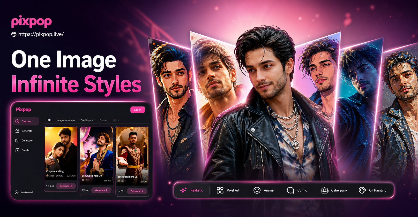
When you have a character you love, whether it is an original mascot, a portrait, or a pet, you often want to see that same personality rendered in completely different visual languages. The phrase character in different art styles points to this exact need: keeping one identifiable subject while moving between anime, watercolor, cyberpunk, clay, and many other treatments. Instead of redrawing everything by hand, you can now use an AI image to image tool to apply these style shifts in minutes. This guide explains how to prepare your character, which styles produce the strongest results, and how to use a mobile AI app like pixpop to generate consistent variations without losing the original likeness.
pixpop is available on Google Play as a mobile app. You download it, upload your character image, and pick a style filter. The AI handles the rest. No desktop interface or prompt engineering background is required. Because pixpop combines image generation with more than one million style filters and templates, you can explore a huge range of looks from a single reference.
When you use pixpop, you are not limited to one art style. You can upload a single portrait and generate dozens of variations in minutes. The key is to treat each generation as a controlled experiment: keep the source image identical, change only the style filter or style prompt, and compare the results.
Why Put One Character in Different Art Styles?
Showing a single character across multiple styles helps creators, marketers, and storytellers see how flexible an identity can be. A mascot that works as a clean vector may also need a watercolor version for a book cover, a pixel version for a game, and a cinematic version for video. Concept artists use style sheets to communicate mood. Social media creators use them to build carousel posts that grab attention. By testing one subject in many visual languages, you learn which treatment best matches your audience and your message.
This approach is also useful for testing how a character design translates into merchandise, animation, or game assets. A style that looks charming in a pencil sketch may not work as a pixel sprite. By generating multiple style versions early, you can spot visual problems before committing to a final direction.
How AI Image to Image Keeps the Character Recognizable
Instead of creating from scratch, an AI image to image workflow starts from your uploaded photo. The model reads facial structure, clothing details, and color palette. Then it applies a target style while preserving the original pose and key features. This is different from text to image generation because you anchor the result with a real reference. The outcome is a version of your character that feels familiar but is painted or rendered in a new medium.
Some tools blur faces or blend identities. The strongest approach is to upload a clear reference image, choose one style template per generation, and review the result before trying another style. That reduces style mixing and helps you control the final look.
For example, if you upload a photo of a person with a distinctive jawline and curly hair, the AI tries to keep those markers while retexturing the image as watercolor or 3D clay. The quality of the likeness depends heavily on the clarity of the reference. A blurry or heavily filtered photo will produce a less faithful result.
Preparing Your Character Image for Better Results
- Use a front facing, well lit photo with the eyes clearly visible.
- Remove busy backgrounds or crop tightly around the subject.
- Choose a high resolution image so the AI can capture texture and facial details.
- Keep the full head and shoulders in frame when possible.
- Save multiple angles if you want to test side profiles or three quarter views.
- Make sure the character is not wearing heavy filters or face paint unless that is part of the design.
10 Art Styles to Try with Your Character
Each style below works well with an image to image generator. Apply each one to the same reference photo for a clean comparison grid. The names may vary by app, but the visual goals are the same.
- Anime: Smooth lines, large expressive eyes, clean cel shading, and bright accent colors.
- Ghibli: Soft hand painted backgrounds, warm natural light, and gentle rounded facial features.
- Watercolor: Light washes, visible paper texture, and soft edges around the subject.
- Oil Painting: Rich colors, visible brushstrokes, and dramatic light and shadow.
- Cyberpunk: Neon signs, rain soaked streets, and high contrast purple and cyan lighting.
- 3D Clay: Rounded plasticine shapes, soft studio lighting, and a playful tactile feel.
- Pixel Art: Crisp edges, limited color palette, and a retro video game charm.
- Comic Book: Bold outlines, halftone dots, and high impact action colors.
- Pencil Sketch: Clean line work, cross hatching, and a raw hand drawn quality.
- Fantasy: Elaborate costumes, magical glowing accents, and dramatic fantasy landscapes.
Not every style works equally well for every face or body type. A very dark cyberpunk treatment may hide facial features, while a light watercolor look may soften edges too much. If a style loses too much identity, try a lighter version of the same filter or use a closer crop on the face.
Try These Character Style Prompts
If your AI app supports text prompts alongside a reference image, these starters can help you control the output more precisely. Replace the character details with your own subject. Keep the same wording for identity related features, such as face shape, eye color, and hair style, so the AI holds the likeness across generations.
- Anime portrait of a calm young man with dark hair, soft pastel background, clean cel shading, gentle smile, same face shape as reference.
- Watercolor painting of a girl with curly red hair, soft edges, paper texture, delicate pink and blue washes, keep facial features unchanged.
- Cyberpunk version of the character, neon signs, wet city street, purple and cyan lighting, high contrast, cinematic framing.
- 3D clay sculpture of a friendly dog character, soft plasticine texture, studio lighting, rounded shapes, warm background.
- Ghibli style scene with the character standing in a summer meadow, hand painted background, soft nostalgic colors, expressive eyes.
- Oil painting portrait in the style of a classical master, dramatic chiaroscuro light, deep green curtain, visible brushstrokes, same facial features.
- Pixel art sprite of the character, 32 bit style, limited palette, side view and front view, crisp edges, retro game look.
- Pencil sketch study of a woman with shoulder length hair, clean line work, cross hatching, white background, same jawline and eyes.
You can also combine a style filter with a prompt for background details. For example, choose an anime filter and add a prompt about cherry blossoms or city streets. The reference image keeps the subject stable while the prompt adds environmental detail.
Step by Step: Creating Character Variations in pixpop
- Download the pixpop app from Google Play and open it on your phone.
- Tap the image to image or style transfer tool and upload your character photo.
- Choose one of the many style filters, or type a short style prompt if you want extra control.
- Generate the image, save the result, and repeat with a new style using the same reference photo.
Because pixpop is a mobile only app, you can create and compare styles while you are on the go. The app stores your generated images, so you can review them side by side and pick your favorites.
How to Keep Your Character Consistent Across Multiple Styles
- Use the same reference image for every variation.
- If you generate from text only, include the same detailed character description each time.
- Keep the pose relatively neutral so style changes remain the main focus.
- Check that key features, such as eye color, hair shape, jawline, and accessories, stay visible in the output.
- Regenerate when a style overpowers the face, and slightly reduce the style intensity if your app allows it.
Common Problems and Quick Fixes
- Face looks different: Crop closer to the face and regenerate. Use a higher resolution source image.
- Two styles mixed together: Apply one style at a time instead of stacking multiple filters.
- Background distracts: Use a simple background or choose a style template with clean scenery.
- Details look blurry: Start with a sharper photo and avoid upscaling a small image before generation.
- Colors feel off: Check your reference image white balance and try a different style filter with a cooler or warmer tone.
Putting Your Character Style Sheet Together
Once you have a set of variations, arrange them side by side to see how the same identity holds across styles. This works well for character design presentations, social media carousels, and portfolio work. The quickest way to build a style sheet is to keep one master reference photo, apply each style one at a time, and label each output with the style name. You can then choose the versions that best fit your project.
Ready to See Your Character in a New Style?
You do not need to learn complex drawing tools or spend hours restyling artwork. The fastest path is to download the pixpop app, upload your favorite character image, and start applying style filters. Experiment with a few styles from the list above, and keep the reference photo consistent for the best identity match. With more than one million templates available, your character can take on a completely new look in seconds.